A Tour of Bus Company Logos
Brand Museum Docent
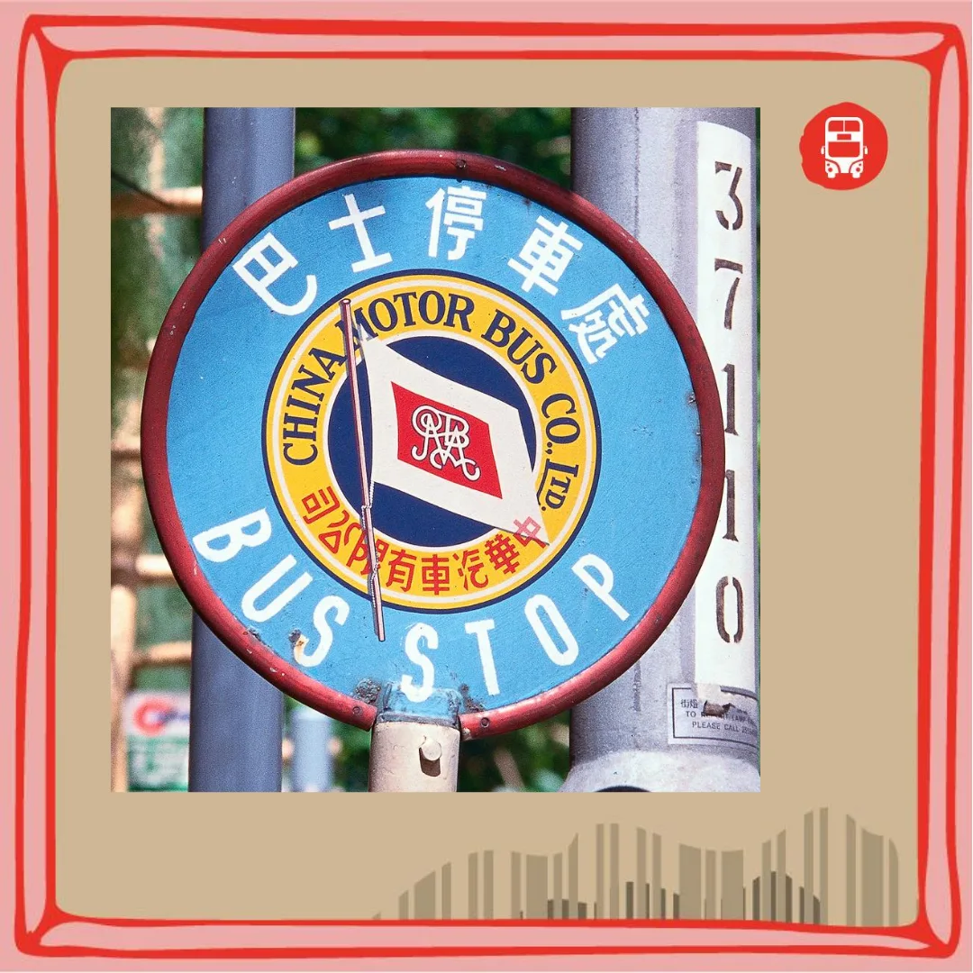
Get to know the brand logo designs of Hong Kong’s bus companies
I. China Motor Bus and KMB
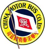 The brand logo of the China Motor Bus Company
In those days the logos of both China Motor Bus (中巴) and KMB (Kowloon Motor Bus, 九巴) were circular designs, rather like badges, containing authority-evoking design elements such as flagpoles and banners.
KMB’s used nine dragons together with its English initials, KMB, as the main content; China Motor Bus formed a flag motif from its English initials in a cursive script, with its Chinese name arranged right to left.
The logo KMB adopted at its founding in 1933 remained in use until 1982.
The new design launched in 1982 switched to a predominantly red composition, combining a motif symbolising the character 九 (“nine”) with the English initials KMB, under the slogan “KMB — better service every day” (九巴服務日日進步).
In 2017 the logo was simplified again, built mainly around KMB — proof that many brands’ logo designs must be refreshed as times change.
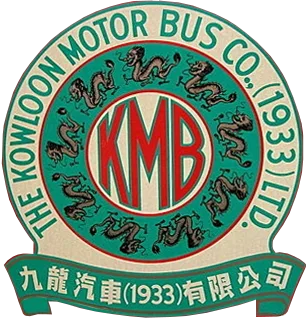 The brand logo of Kowloon Motor Bus from 1933 to 1982
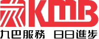 The brand logo used by KMB from 1982 to 2017
 The brand logo used by KMB after 2017
II. Citybus and New World First Bus
The Citybus logo has been in use since 1991. The arrow and the several horizontal lines in its design were intended to convey a sense of flight — creating a feeling of dynamism and constant forward motion, symbolising the rapid growth of the bus business. As for the New World First Bus logo, the green motif is the English letters NW, short for New World, while the figure 1 inside the orange circle represents Britain’s FirstGroup. Later, FirstGroup ceased to be involved in operating New World First Bus, and from 2016 the company was wholly operated by NWS Holdings. Reportedly, in August 2020 NWS planned to sell off both New World First Bus and Citybus in their entirety. Do keep an eye on whether these various brand logos will see any updates in future.
 The brand logo of Citybus
 The brand logo of New World First Bus
III. New Lantao Bus and Kwoon Chung
Kwoon Chung Bus Holdings was founded in 1948 by Mr Wong Kwoon-chung, its original business being vehicle cleaning services. The W in the Kwoon Chung logo stands for the Wong family. New Lantao Bus (嶼巴) is a franchised bus company under Kwoon Chung. In 2017, New Lantao Bus replaced the old emblem it had used since the 1970s with a bright-green letter N. The centre of the old emblem depicted the terrain of Lantau Island as it was in the 1970s; in the new logo, the green represents Lantau’s mountains and trees, and the N is taken from the first letter of the company’s English abbreviation, NLB (New Lantao Bus).
 The brand logo of Kwoon Chung Bus
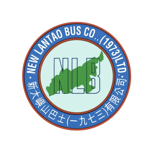
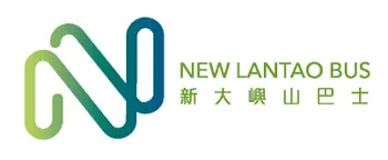
The brand logo of New Lantao Bus
Logo sources:
https://hkbus.fandom.com/wiki/%E4%B8%AD%E8%8F%AF%E5%B7%B4%E5%A3%AB
https://hkbus.fandom.com/wiki/%E4%B9%9D%E9%BE%8D%E5%B7%B4%E5%A3%AB
https://hkbus.fandom.com/wiki/%E4%B9%9D%E9%BE%8D%E5%B7%B4%E5%A3%AB
https://www.nwstbus.com.hk [archived]
https://hkbus.fandom.com/wiki/%E6%96%B0%E5%A4%A7%E5%B6%BC%E5%B1%B1%E5%B7%B4%E5%A3%AB
https://hkbus.fandom.com/wiki/%E6%96%B0%E5%A4%A7%E5%B6%BC%E5%B1%B1%E5%B7%B4%E5%A3%AB